Entries Tagged as ''

Project 4: New Money

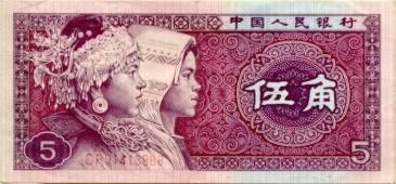
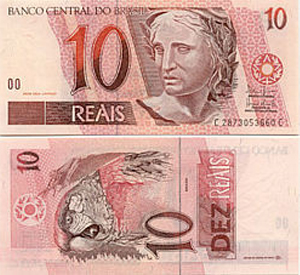
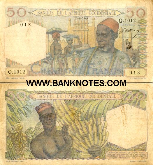
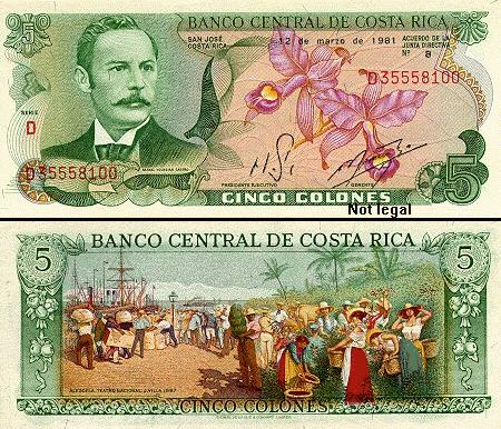
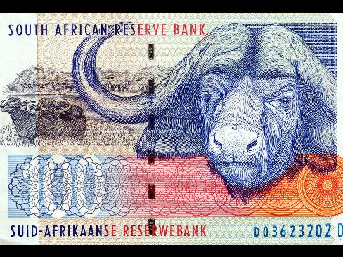
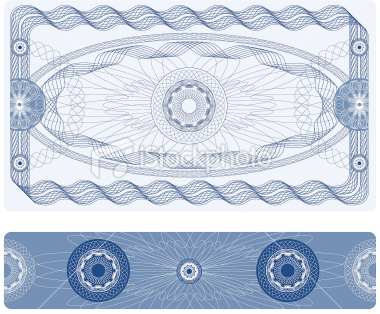
Most countries of the world have developed their own form of paper currency, or bills.  Here are some examples:

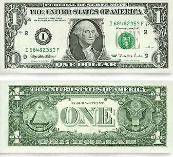
Some people say that, in comparison the United States has boring currency.  What do you think?

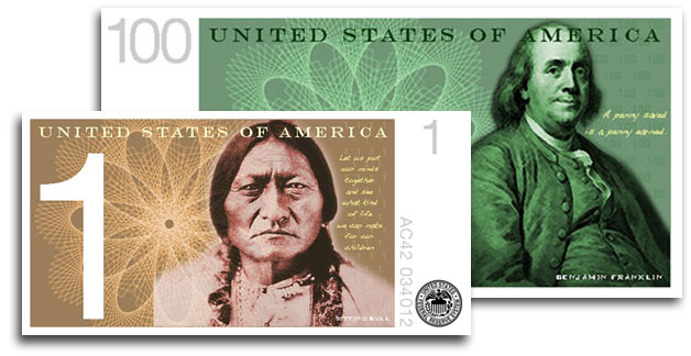
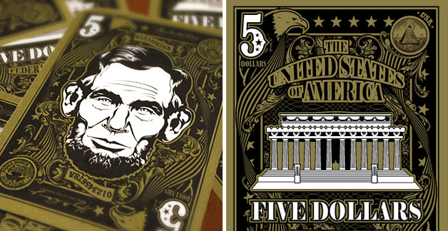
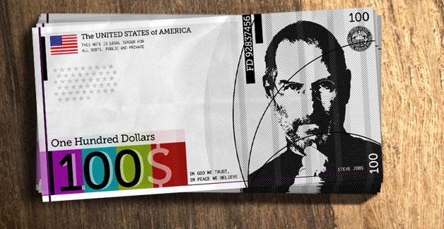
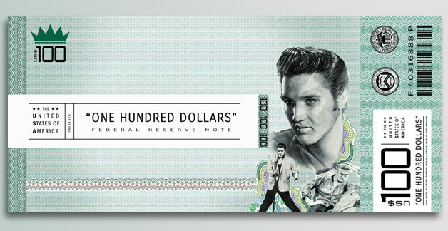
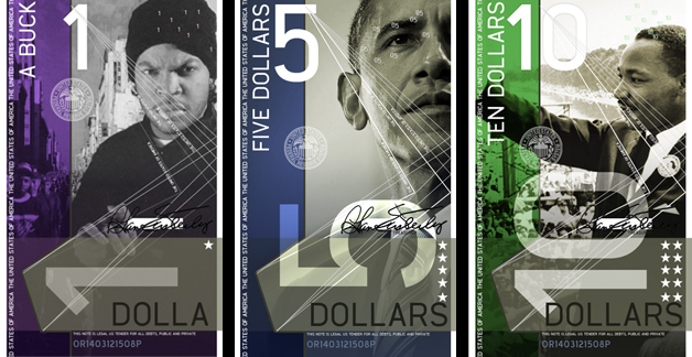
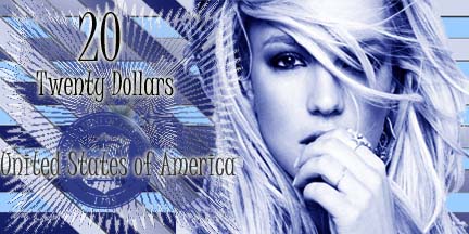
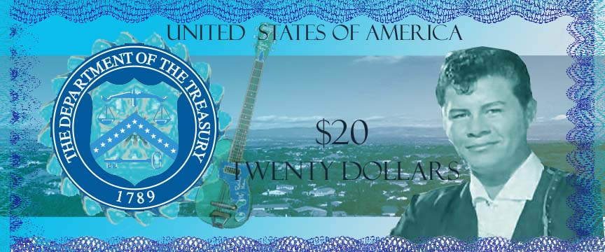
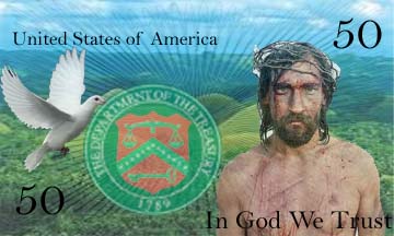
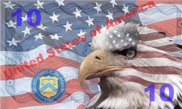
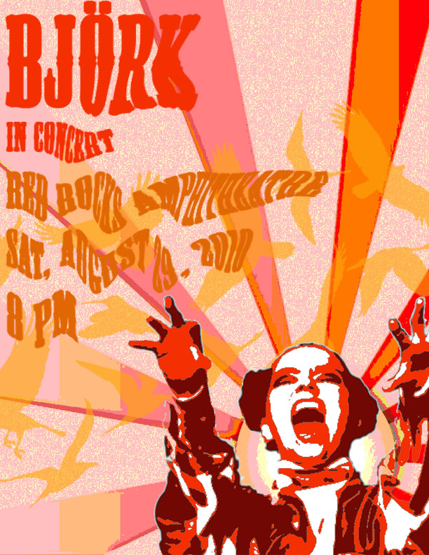
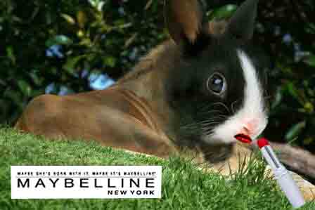
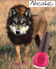
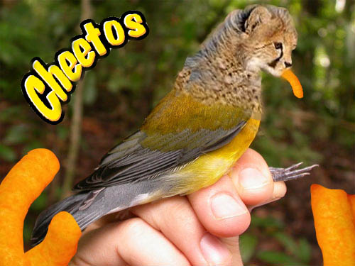
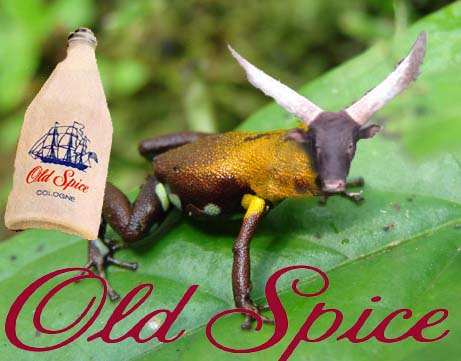
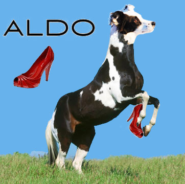
I came upon a website challenging Americans to design new bills, which I thought was a fun idea.  Here are some of the designs people came up with:

You are going to design a new bill.  But first, you need to decide:

Who/what would you put on the a bill to represent the US, and why?  You will need to explain your reasons when you post your design.  First, brainstorm.  What ideas does the US stand for?  Life, liberty, and the pursuit of happiness? Ingenuity?  Innovation? Integrity?  Entrepreneurship?  Equality?  Arts?  Strength? What should our country stand for?  Who/What would represent these ideas?

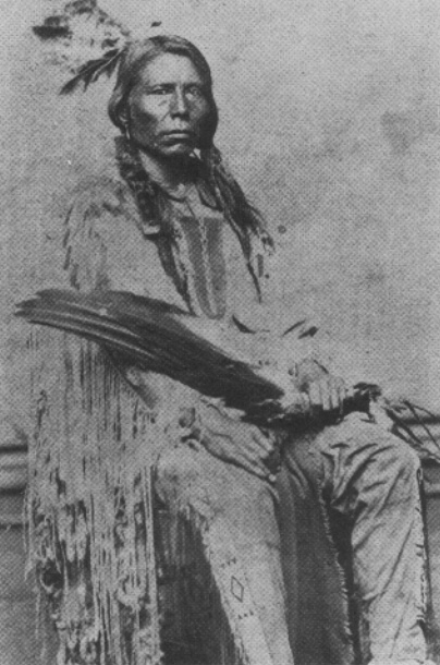
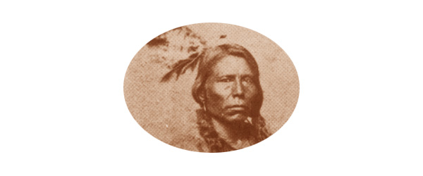
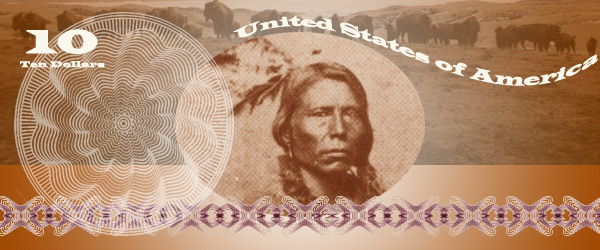
I chose Crazy Horse as my person because he nobly fought for the rights of his people when he felt that they were being treated unfairly by the US government.

1. Decide on the dimensions of your bills.  Are they rectangles/squares/horizontal/vertical?  Open a new Photoshop document in that shape.  Don’t make it too huge, it has to fit in your wallet!

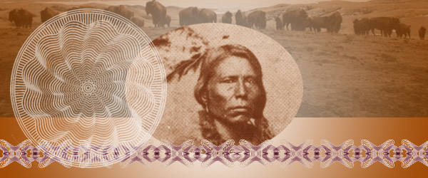
2. You could  cut a circle around your person/animal/thing or delete the entire background.  Look back at the examples.  I cut an oval shape around Crazy Horse using the Circle Marquee Tool.

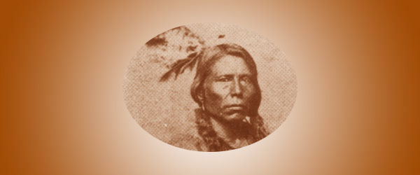
2.  Stylize your person/animal/thing somehow.  Suggestions: Anything under Image->Adjust or any Filter.  I did Image->Adjust->Color Balance to make Sitting Bull a brownish color.

3. Add a general background to your bill to match the person/animal/thing.  I chose a gradient in brown and white:

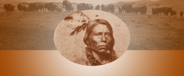
4. Add some other sort of background element, perhaps a place associated with your person/animal/thing?  I chose a photo of the Lakota Reservation with buffalo, another American symbol.  Adjust the opacity so it fades into the background some and colors to match.

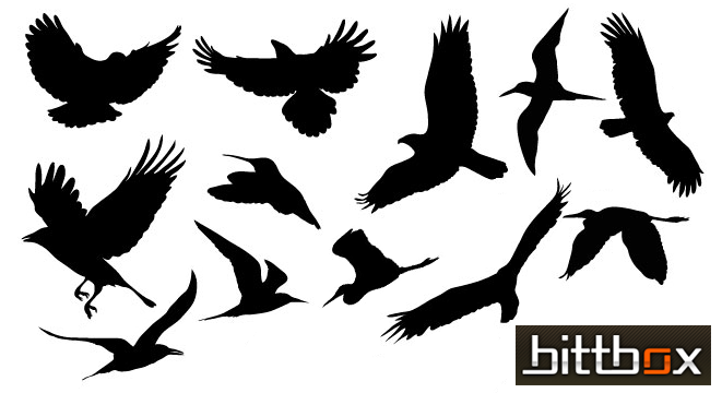
5. A lot of money has lacy floral type patterns called guilloche rosettes. Here are some I found but feel free to find your own:

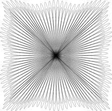
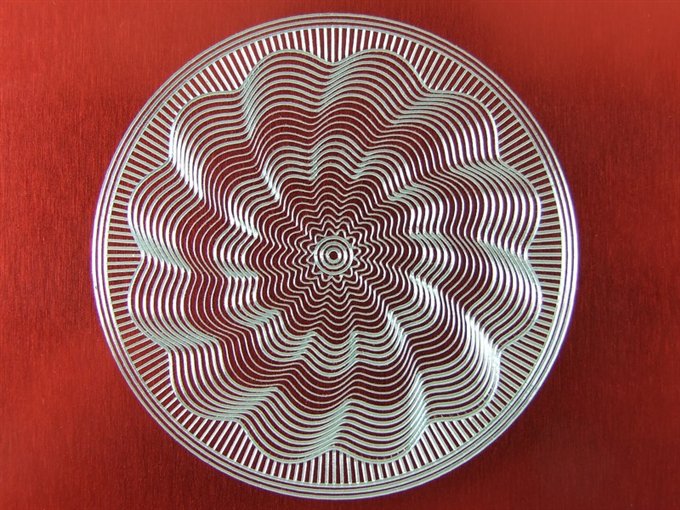
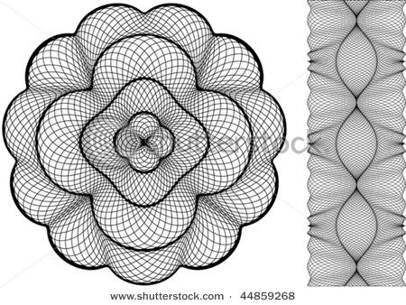
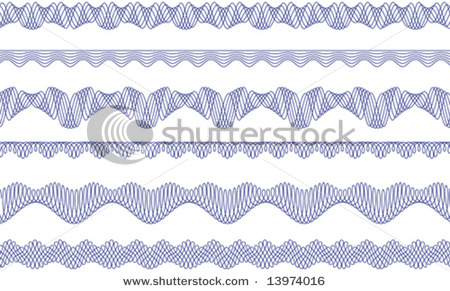
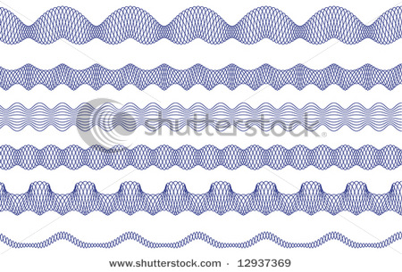
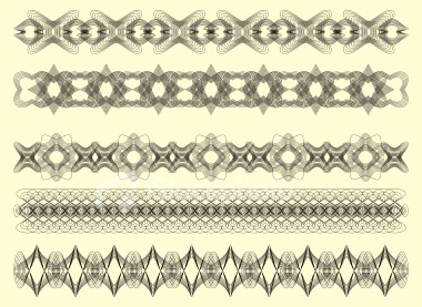
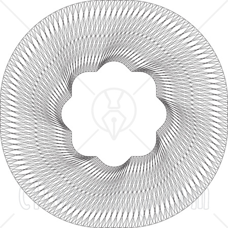
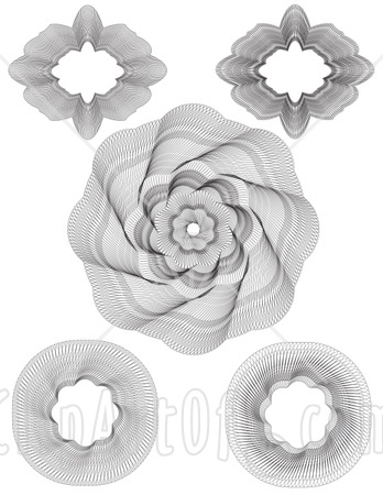
Incorporate one or more of these into your design.  Remember, you can always change the color!

6. There needs to be some information on your bill.  Remember, the type is a part of your design, make it look cool!

Amount – both numerically and in English (5, Five Dollars)

CountryUnited States of America

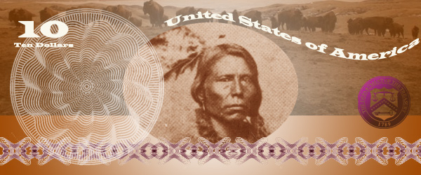
7.  In order for this money to be official, we need the Seal of the US Department of the Treasury. It is used on all U.S. paper currency, and (like other departmental seals) on official Treasury documents. The seal includes a chevron with thirteen stars, representing the original thirteen states. Above the chevron is a balance, representing justice. The key below the chevron represents authority and trust.

Remember, you can (and should) change the seal to match your design!  I adjusted mine using Image->Adjust->Threshold, deleted the white, selected the black, and then gave it a purple-brown gradient.

8. Flatten image and post it to your blog.  Explain why you chose the person/animal/place that you did to represent the US.  What tools did you use in this project?  Did you learn anything new? I can’t wait to see what you come up with.


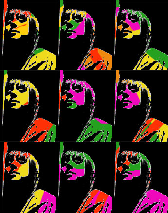
Student Examples from last semester:


Project 3: Concert Poster

Concert Posters are works of art.  Check out examples on Google Images.  You will create a poster for a band or artist advertising the event of a concert.

1. Pick your artist/band.  Find a good, dramatic photo of them and make sure its not too small.  Open it up in Photoshop and get rid of the background.   Make it black and white under Image–>Adjust–>Desaturate.  Blur it a little under Filter–>Blur–>Gaussian Blur.  Posterize it under Image–>Adjust–>Posterize (3-4 Levels).  SAVE!

From this                                                                                    To this

2. Find two large vector graphics to combine to make your background. Vector graphics is the use of geometrical primitives such as points, lines, curves, and shapes or polygon(s), which are all based on mathematical equations, to represent images in computer graphics.  Look at these links: vector wallpaper, vector backgrounds, geometric design, free vectors, vector ray or find your own.  I chose to use these two:

3.  Open a new document in Photoshop that is 8 1/2 inches wide by 11 inches tall.  Paste one of your vector backgrounds into this document and rotate, move it until you like the composition.  If your background has a lot of detail, posterize it under Image–>Adjust–>Posterize (3-4 Levels).  If you don’t like the colors, change them under  Image–>Adjust–>Hue/Saturation.

My 8 1/2 x 11″ posterized vector background

4. Paste the image of your artist/band onto your background.  You need a color scheme to tie the poster together.  I chose to make my poster in all warm shades like red, orange and yellow.  Click Select–>Color Range and then click on a black part of your artist/band.  Choose a dark color in your color scheme and then click Edit–>Fill–>Foreground Color.  The black should now be the new color.  Repeat this step with the shades of grey in your artist/band.  Your artist/band should now match your background.

5. Paste your second vector image into the document.  Make it the middle layer.  Posterize it, and change the colors to match the color scheme.  Adjust the opacity level so that you can see through it to the back layer.

6. Now you need to create the text for your poster.  The poster should include the name of the artist/group, the venue (place) they are playing at, the date and time and if you choose, the opening band.  Pick a cool font and colors to match your color scheme.  Next, distort your text in some way.  First rasterize the type layers by right clicking on it and selecting Rasterize.  Now you can change the text in different ways.  You could click Edit–>Transform–>Skew, Distort, or Perspective.  Another option is to click Filter–>Distort and try out the different options.  Make sure your text is somewhat legible!  Use the skills you learned in the last TEXT assignment!

7. Phew!  Once you are finished, flatten image and save as a jpeg.  Post your poster to your blog.  What new did you learn how to do on photoshop with this assignment?  What do you think of your product?

Assignment 7: Text

1. Drop Shadow – Manual Drop Shadow

  1. Open a new document and type some text about 72 points.  Chose a thick font!
  2. Duplicate the type layer.
  3. Change the text color on the bottom layer to black.
  4. Move the black text layer several pixels down and to the right.
  5. Apply Filter > Blur > Gaussian with a radius of about 2-5 pixels depending on the type size.
  6. Adjust the opacity of the shadow layer as desired.
  7. Add some sort of background to your text.
  8. Flatten image and save as a jpeg under drop shadow.

2. 3D Text – Manual 3D Raised Text3D Emboss Text

  1. Open a new document ( 6 x 4″) and type some text about 72-100 points.  Chose a thick font!
  2. Duplicate the type layer twice. You should have three identical layers.
  3. Move the bottom-most layer two pixels up and two pixels left and change the type color to white.
  4. Move the middle layer two pixels down and two pixels right and change the type color to black.
  5. Fill the background with the same color as the topmost type layer.
  6. Flatten image and save as a jpeg under 3d.

3. Perspective Shadow Perspective Shadow

  1. Open a new document and type some text about 72 points.  Chose a thick font!
  2. Duplicate the type layer.
  3. Change the text color on the bottom layer to black.
  4. Skew the bottom layer to the right so it looks like a shadow on the ground.  Photoshop 5.5 &6.0 Edit–>Transform–>Skew Photoshop Elements Image–>Transform–>Skew
  5. Photoshop 5.5: Render the black type layer under Layer–> Type–> Render.   Photoshop 6.0 Rasterize the black type layer by right clicking on it and selecting Rasterize.  Photoshop 8.0 right click the black type layer by right clicking it and selecting simplify layer.
  6. Select the gradient tool and set the options for black to white.
  7. Hold the Ctrl key and click on the black type layer
  8. Click once at the baseline of the type, then hold the shift key down and click again at the tallest point of the shadow layer.
  9. Bump the shadow layer up one pixel.
  10. Add some sort of background to your text.
  11. Flatten image and save as a jpeg under Perspective Shadow.

4. Motion Text Motion Text

  1. Open a new document and type some text about 72 points. Italics work well.
  2. Duplicate the type layer.
  3. Render/Rasterize the bottom layer.
  4. Filter –> Stylize –> Wind: Method-Wind, From the Left
  5. Move the Wind layer a few pixels left.
  6. Filter –> Blur –> Motion Blur: Angle-0, Distance 10-15 pixels.
  7. Adjust the position of the blurred layer again if necessary.
  8. Reduce the opacity of the blurred layer to about 60-80%.
  9. Add some sort of background to your text.
  10. Flatten image and save as a jpeg under Motion.

Project 2: Hybrid Animal AD

There are many hybrid animals in mythology, that is creatures that are a combination of  two or more animals.  One common hybrid is a mermaid (part woman, part fish).  What hybrids can you think of?  Here is a list from Wikipidia.

I want you to create your own hybrid using Photoshop, and have that hybrid advertize some product.  In my example, I made a Dog/Horse which is advertising Aldo shoes.  You may choose which animals to combine, and which product to endorse.  You will isolate different parts with the magnetic lasso tools.  Make your two creatures join as seamlessly as possible by adjusting the different parts to the right size, angle, color.

Include the Product (ie I put the shoe on the Lola Horse), and the Product Logo (ie the ALDO).  Think about composition and placement of the animal, background, product, and brand logo so it is well balanced and pleasing.

Use the clone tool for making fur/scales to cover where two parts are joining!  Make one animal part fade into the another by adjusting the opacity of the clone brush.   Good luck and have fun!  I will definitely demonstrate this for you because its a little complicated!

Assignment 6: Clone Stamp Tool

Clone Stamp Tool

I want for you to practice with the clone tool, which is very useful.  Using this tool, you can copy a portion of an image and reapply it repeatedly to cover an unwanted portion of the image.

Hold down Alt to choose the area to clone, click.

In a new layer, clone the sample that you took and paint it over a part you want to cover.

Using the clone tool, you will open up the following pictures and modify them.

1.  Remove the cruise ship from this photo: Cruise Ship
2. Remove the bottom blue angel airplane and replace it with the sky & clouds background. Make sure that you use the correct background sample (use sky if the plane is in the sky, and clouds if it is surrounded by clouds). Blue Angels
3. Remove the ship on the right. There are people in the water also, and they should be replaced by water. Pirate Ship Save all three pictures as jpegs and post themto your blog under the title Assignment Seven.

Write about your experience with the Clone Stamp ToolWhat does it do? What could you use it for?

Project One: Pop Art

Repetition can be a good thing in art.  Now that you know how to move, manipulate and add different layers, as well as make selections with different tools you are ready for your first project.

1.Decide what image you want to repeat, a person, animal, object, plant…whatever.  This image should be a photograph, no cartoons or computer graphics.  Save the jpeg image and open it in photoshop.

I chose Cat Power

2. Adjust the threshold of your image.

3. Under Select–>Color Range, click on a white part of the image.  All of the white in the image should now be selected.  Delete it.  You should now see a checkered pattern where there was white.  This means it is transparentSelect all of the image and copy it.

4. Open a new blank document in photoshop.  You can pick the dimentions in inches.  Make them add up to around 10, ie 4 x 6 inches more or less.

5. Paste your image into this new document.  Shrink it under Edit–>Transform–>Scale.  Copy it again and make at least 9 total.  Arrange them in a pleasing way, doesn’t have to be a grid like mine.

6. Add a new layer behind your pattern.  Using the paintbrush tool, paint some design with bright colors (at least 4).  Here is mine.

Here they are together.  Pop Art!

7. Flatten your image, save it as a JPEG and post it onto your blog under Project One: Pop art.  Write about your first experience actually making art with photoshop.  What was easy/difficult/annoying/awesome?  Do you like your product?

Assignment Five: Lasso Tools

1. Download this picture. Select the stork using the Regular Lasso tool.  Hit the Delete key to erase the stork.  Flatten the image under Layer–> Flatten Image.  Save the image as a jpeg.

2. Download this picture. Use the Polygon Lasso tool to select the house.  Go to Selection>Inverse Selection to select everything but the house.  Apply a Filter. Flatten the image under Layer–> Flatten Image.  Save the image as a jpeg.

3. Open a photo of your choice.  Use the Magnetic Lasso tool to select part of it, then change it with an Adjustment or a Filter. Flatten the image under Layer–> Flatten Image.  Save the image as a jpeg.

Post all three photos under Assignment Five.  Write about your experience using the Lasso Tools.  Were they easy to use or difficult?  Which seemed to have the most capabilities?

Assignment Four: Rectangular and Elliptical Marquee Tools

Open a jpeg picture of your choice in Photoshop.

  1. Make a Rectangular Marquee selection.  Click Select –> Inverse.  Change this selection under Image –> Adjust.
  2. Make an Elliptical Marquee selection, Change this selection under Image –> Adjust.

Flatten the image under Layer–> Flatten Image.  Save the image as a jpeg and post it to your blog under the title Assignment Four.

Write about your experience with the Rectangular and Elliptical Marquee Tools. What possibility do you see with these tools?

Assignment Three: Maneuvering different Layers

1. Download the file Layer_Practice.psd. Open Layer_Practice.psd. in Photoshop. Change the order of the layers on the document so you can see all the features of the South Park character.  Find a jpeg photo from the internet to use as a background for her.  Copy and paste it into the Photoshop document.  If it isn’t the right size, adjust it under Edit –>Transform–>Scale.  Make sure the background is the bottom layerFlatten the image under Layer–> Flatten Image.  Save the image as a jpeg and post it to your blog under the title Assignment Three.

2. Write about your experience maneuvering Layers in Photoshop.

Assignment 2: Using the Move Tool

1. Download the file move_practice.psd. Open the file in Photoshop.  Use the Move tool to assemble these pieces into the South Park character.  Once you have assembled the character, flatten the image under Layer–> Flatten Image.  Save the image as a jpeg and post it to your blog under the title Assignment Two.

2. Write about your experience using the Move Tool in Photoshop.