Art for Parks Marine Invertebrate Print

Every year, schools in Seward participate in the Art for Parks program which is run by CJ Rae at the Parks Service.  The Parks Service pays for art supplies for us to make art honoring our amazing Kenai Fjords National Park!  The theme this year is the Marine Invertebrates which reside in Ressurection Bay.  I’ve made a list of the ones that I think would make cool art pieces, but there are many more if you want to do some research yourself!

Cnidaria: Jellyfish

Crustacean: Crabs, Shrimp

Echinoderm: Starfish, Sea Urchins

Mollusca: Squids, Octopus

We are going to make linocut prints. We are going to design our projects in Photoshop, but carve and print them by hand.

Here is an example of a linoleum print:

898d8292a9a3483c0231bd78cbb687cf[1]

Here are the steps to making yours:

1. Chose an intresting image of an Alaskan Marine Invertebrate.  I chose the Pacific Octopus:

Giant Pacific octopus

2. Open the image in Photoshop.  If you need to make it more clear, cut it out and put a solid background behind it.

3. Make the image black and white under Image–>Adjust–> Black and White

4. Posterize the image under  Image–>Adjust–> Posterize

Make it between 2-5 levels, whichever looks best to you.

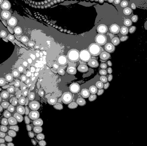
5. Crop your image into a square.  Mess around a bit to decide which parts to cut off!  This is how mine turned out.

posterizecropped octo

From here out, its by hand!


Seward Community Foundation Seward High School Media Project

You live in Seward, Alaska.  This is a small, isolated town nestled between big mountains and the bay.  The good in this town is a tight knit community in a beautiful setting.  Perhaps some of the negative aspects about living in Seward is a lack of things to do, compared to living in a larger city.

As a teenager, what sort of activities would you like to have available to you to do in Seward?  What sort of places would you like to go to?

 Suggestions:

Live Music

Movie Theatre

Ice rink

Pool – billiards

Bowling Alley

Ski Resort

Events: Festivals/ Competitions

Better/more variety of Jobs


This is your assignment:

Produce a short video presentation that portrays the teenage perspective on the following questions:

  • What do you like best about living in Seward/Moose Pass?
  • When you think of community improvements, what does our community need to make it better for the next generation?
  • What would make you want to live here as an adult?  What makes our community attractive to young people?

-Must be “G “rated suitable for all audiences.

-Complete by May 1, 2014


Step 1:

Formulate your Opinion in Writing

Write a short essay answering these questions:

  • What do you like best about living in Seward/Moose Pass?
  • When you think of community improvements, what does our community need to make it better for the next generation?
  • What would make you want to live here as an adult?  What makes our community attractive to young people?

Use complete sentences, correct grammar, etc.  Post it on your blog

Step 2:

Illustrate your ideas

This is a movie so it needs visuals.  You could illustrate your ideas with:

Photographs that you take (copyright)
Your photos edited with photoshop (draw in the things that you want in Seward 🙂 )

Drawings – draw on paper, a tablet or the smart board

Film

*If you dont have a camera the library has some that you could check out.

Please take photos/videotape after school.  Drawing might be the easiest option because you can do it at school!

Step 3:

Make your movie!

How to Make the Movie!

Now that you have your images to create your movie, you need to use Windows Movie Maker to make them into a little movie.  Here’s how you do it:

1. Open Windows Movie Maker under programs.

2. Under Capture Video, click Import Pictures and select all of your images.

3. Select your pictures from the collections board and drag them down to the storyboard at the bottom, one by one, in whichever orer makes sense.

4. Record the Audio Track.  Record yourself reading your essay or speaking on the same themes as your essay.  The library has microphones to plug into the computer.

5. Go to Edit Movie -> Make titles or Credits.   Create a Title Slide with the Title of the animation.  Create Credits at the end:

Created by ______________

Seward High School

Seward, Alaska

2014

Music: This Song by This Person

6. Add music in some parts!  Use this website: http://freeplaymusic.com/.  This music is not copyrighted and the site is easy to search!

Once you have the audio file in the Collections area, click Show Timeline on the bottom, and then drag that audio file down into your movie.  You can now move it to determine when the sound starts, ends, etc.

7. Tweak with everything until your message is clear, everything flows well, and there are no glitches!

8. Finish your movie!  Once everything is perfect, you need to save your movie as a Windows Media Player file so that anyone can watch it.  Under Finish Movie, click Save to my Computer.  Choose to save your movie inthe L drive, under your e number.  This is because your movie is a big file that takes up a lot of space.  Name your movie with the file name, but don’t include any spaces in the title, for example, save it as kittydream, not Kitty Dream.  Click Next, and under Movie Setting, Other settings, choose Video for broadband (512 Kbps).  Click Next again, now your movie is saving as a WMM file, this should take a minute or so.

10. Post your movie!  On your blog, click Plugins ->Embedded Video -> Activate.  Then in a new post, click on the little TV symbol.  Choose the tab that says upload video.  Find your video in the L drive, and upload it.  Click  the box that says Show video without link.  Save your post and preview it to make sure your video plays!

11. Under your movie, write about your experience in making your first animation and Windows Movie Maker.  What did you learn?  What did you like? What didn’t you like?

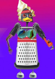
Project 7: Robot Creature

Create a Robot out of random objects!

Include:

Head

Body

Shoulders

Arms

Hands

Feet

Chest

Face

Eyes

Mouth

Nose

Hair

Be creative!  Have fun! You could use any objects that you could imagine to create your creature as long as you represent all of the body parts.

Add a background of your choice, post it onto your blog and write about it.

Project 6: Mount Marathon Logo

Here is some more real world graphic design:

The Seward City of Commerce is looking for a logo for the 2015 Mount Marathon Race.

Here are the rules:

size 8 1/2 x 11 inches

resolution at least 300 pixels per inch!

Only 4 colors

Include:

Mount Marathon Race

July 4 2015

88th Running

Seward, Alaska

The word “finisher” or “survivor”

Must have a mountain theme

We will actually enter these and the winner recieves $200!  The chosen design will be made into T-shirts, hoodies, hats, patches, and posters.  Keep in mind that the patches will be round.

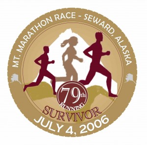
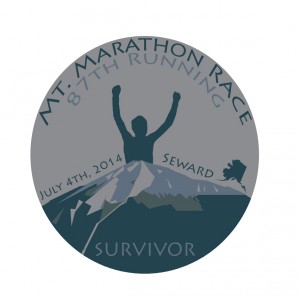
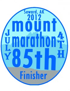
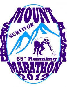
Michael Marshall won this with the design he came up 2 years ago:

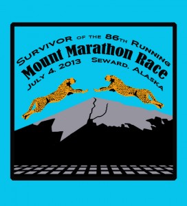
Here are some other cool designs from the past:

thomas

Gabe Esposito

Jacob Sears

My Rules:

Include a mountain and something to represent running.  Remember, good logos are bold and get the point across clearly.  The point of this logo is a hardcore race up a mountain in Seward, Alaska.  How can you represent these things visually?  Remember, the text is a part of the art, incorporate it into the design, not just as an afterthought.  You know how to add effects, bend it, etc.

I can’t wait to see what you come up with!  Use the knowledge you have learned from your other projects, you are becoming Photoshop masters

* Remember to use royalty free images or to create your own!

Here are other logos for inspiration:

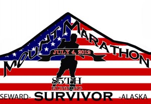
Here is my entry 2 years ago:

I’ll give you some tips on how to do it!

Project 5: Zudy’s Cafe Logo!

Our very Own Judy Odhner is opening a new restaurant in town in April!  It will be located at the Train Depot building which is downtown by the Sea Life Center.  She will be serving Soup, Sandwiches, and Desserts.  And she wants YOU to create her logo! She will give $50 to the student who creates the design she likes, plus your logo will be featured on Menus and T-shirts in her business!

She has requested that it include:

3 colors maximum

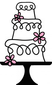
A Tiered Cake

A Classic or Antique (old fashioned) look

Zudy’s Cafe

*You can decide if you want to include the byline:  Soup, Sandwiches, and Desserts

1. Open a document that is 8 x 11 inches and set the resolution at 350 pixels per inch.  This is important to have a high quality image!!!

2. Now you know how to draw cylinders in Photoshop!  This is just a tiny step when it comes to creating a tiered cake for Zudy’s Cafe Logo.  You need to decide the style of your cake.  Do you want it bold, playful, stylized, straight, leaning, rounded, squarish, tall, wide, etc.

Advice when drawing your cake style:

To create vertical or horizontal straight lines, hold shift as you draw a line with the brush tool.  To make a diagonal line, click the brush tool to make the first point, then hold shift and click the second point.  The two points should now be connected into a line.

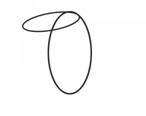
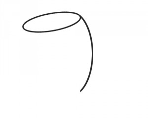
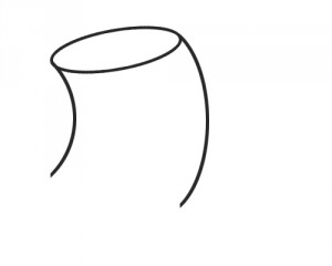
To create curved lines, draw an ellipse with the eliptical tool, stroke the outline (Edit->Stroke), rotate it to whatever angle you want and delete the portion of the ellipse that you don’t need.

curved linecurvedline2curved 3

You could create a S curve using two ellipses.

To distort a line, first draw a straight line, then click Filter->Liquify and make the line wavy!  Try this, its super cool!

Examples of other cake logos:

images-1

images-2


Logo-Cake-altered


1239448-6611

EVERYTHING-Cake-LOGO

4. The Text.  Remember that the Text is a part of your design!  Don’t make it an afterthought but a part of the artwork.  Carefully consider font, size, shape and placement!

5. Color.  You are limited to 3 colors.  How can you balance the composition and make everything clear with 3 colors?  Take your time and try different options!  I’m guessing you will want frosting on your cake.  How will you do that?

Good Luck and have fun with this!  Hope you win!


Assignment 9: Draw Cylinder in Photoshop

For the Next Project, you will need to draw your own multi tiered cake like so:

cake

For this assignment, we are going to simplify, and have you learn how to draw your own cylinder in photoshop so that you can stack them into a cake!

1. Open a new document.  Make it 4 x 4 inches and 300 pixels per inch.

2. Click View->Show->Grid

Make sure View->Snap is checked.  Can you see the grid now?

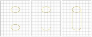
3. Create a new layer.  Use the Elliptical tool to draw a top shape to your cylinder.  Line it up with the grid boxes so its even.  With the ellipse selected click Edit -> Stroke and type in 5 pixels.  Click OK.

Your selection should now be outlined!

4. Duplicate the ellipse outlines layer and move it straight down as far as you want the cylinder to be high (photo 1).

5. Delete the top half of the bottom ellipse (Photo 2).

6. On a new layer, Draw the sides of the cylinder with the brush tool.  Make the brush hard (not fuzzy) and 5 pixels wide to match the line width of the elipses.  Hold shift as you draw so the line will stay perfectly straight.  Move the line over if you drew it a bit off!


Cylinders (19)

7. Shade the cylinder with the gradient tool.  First select the top elipse with the magic wand tool.

Cylinders (22)

8. Use the color you used for the lines and a lighter color.  Have the color fade down lighter (photo 1).

9.  Repeat this step on the walls of the cylinder .  Use a different gradient pattern so that the center of the cylinder is high-lighted.

Cylinders (24) Cylinders (29)

10. Post Your awesome cylinder as assignment 9!  Great job!


Project 4: New Money

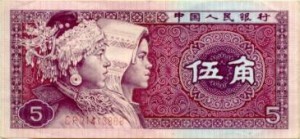
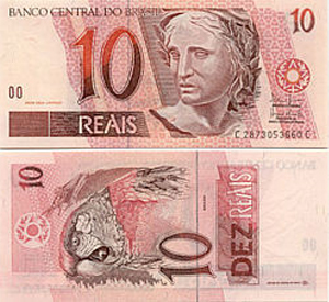
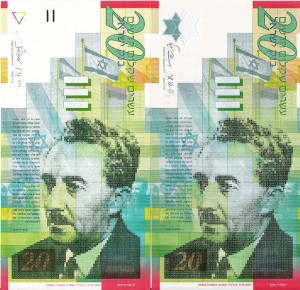
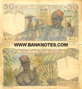
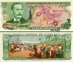
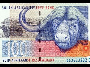
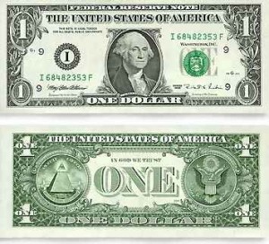
Most countries of the world have developed their own form of paper currency, or bills.  Here are some examples:

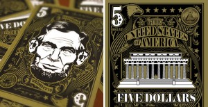
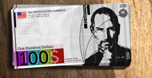
Some people say that, in comparison the United States has boring currency.  What do you think?

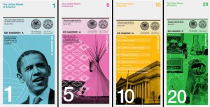
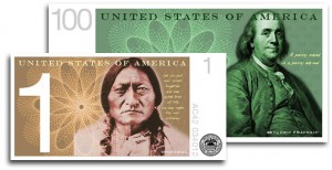
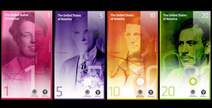
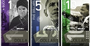
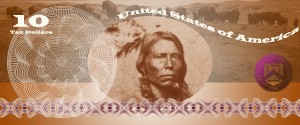
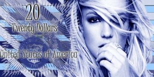
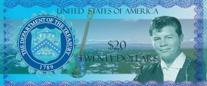
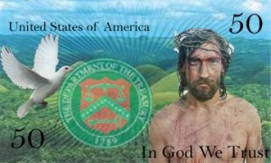
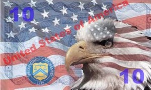
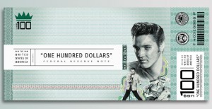
I came upon a website challenging Americans to design new bills, which I thought was a fun idea.  Here are some of the designs people came up with:

You are going to design a new bill.  But first, you need to decide:

Who/what would you put on the a bill to represent the US, and why?  You will need to explain your reasons when you post your design.  First, brainstorm.  What ideas does the US stand for?  Life, liberty, and the pursuit of happiness? Ingenuity?  Innovation? Integrity?  Entrepreneurship?  Equality?  Arts?  Strength? What should our country stand for?  Who/What would represent these ideas?

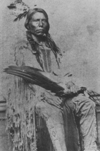
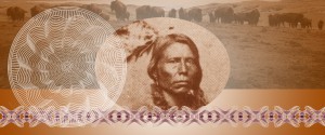
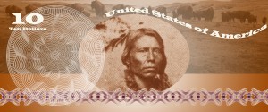
I chose Crazy Horse as my person because he nobly fought for the rights of his people when he felt that they were being treated unfairly by the US government.

1. Decide on the dimensions of your bills.  Are they rectangles/squares/horizontal/vertical?  Open a new Photoshop document in that shape.  Don’t make it too huge, it has to fit in your wallet!

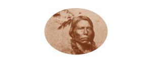
2. You could  cut a circle around your person/animal/thing or delete the entire background.  Look back at the examples.  I cut an oval shape around Crazy Horse using the Circle Marquee Tool.

2.  Stylize your person/animal/thing somehow.  Suggestions: Anything under Image->Adjust or any Filter.  I did Image->Adjust->Color Balance to make Sitting Bull a brownish color.

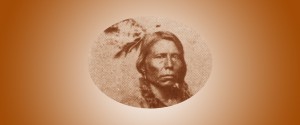
3. Add a general background to your bill to match the person/animal/thing.  I chose a gradient in brown and white:

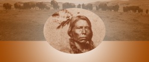
4. Add some other sort of background element, perhaps a place associated with your person/animal/thing?  I chose a photo of the Lakota Reservation with buffalo, another American symbol.  Adjust the opacity so it fades into the background some and colors to match.

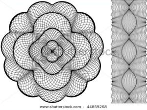
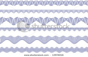
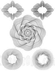
5. A lot of money has lacy floral type patterns called guilloche rosettes. Here are some I found but feel free to find your own:

Incorporate one or more of these into your design.  Remember, you can always change the color!

6. There needs to be some information on your bill.  Remember, the type is a part of your design, make it look cool!

Amount – both numerically and in English (5, Five Dollars)

CountryUnited States of America

7.  In order for this money to be official, we need the Seal of the US Department of the Treasury. It is used on all U.S. paper currency, and (like other departmental seals) on official Treasury documents. The seal includes a chevron with thirteen stars, representing the original thirteen states. Above the chevron is a balance, representing justice. The key below the chevron represents authority and trust.

Remember, you can (and should) change the seal to match your design!  I adjusted mine using Image->Adjust->Threshold, deleted the white, selected the black, and then gave it a purple-brown gradient.

8. Flatten image and post it to your blog.  Explain why you chose the person/animal/place that you did to represent the US.  What tools did you use in this project?  Did you learn anything new? I can’t wait to see what you come up with.


Student Examples from last semester:


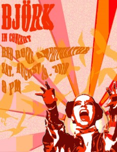
Project 3: Concert Poster

Concert Posters are works of art.  Check out examples on Google Images.  You will create a poster for a band or artist advertising the event of a concert.

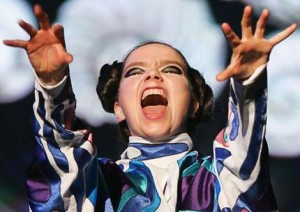
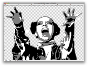
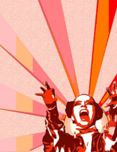
1. Pick your artist/band.  Find a good, dramatic photo of them and make sure its not too small.  Open it up in Photoshop and get rid of the background.   Make it black and white under Image–>Adjust–>Desaturate.  Blur it a little under Filter–>Blur–>Gaussian Blur.  Posterize it under Image–>Adjust–>Posterize (3-4 Levels).  SAVE!

From this                                                                                    To this

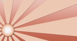
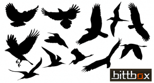
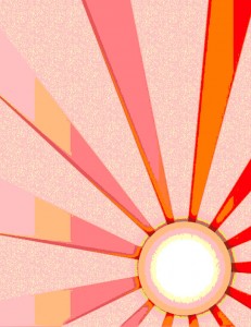
2. Find two large vector graphics to combine to make your background. Vector graphics is the use of geometrical primitives such as points, lines, curves, and shapes or polygon(s), which are all based on mathematical equations, to represent images in computer graphics.  Look at these links: vector wallpaper, vector backgrounds, geometric design, free vectors, vector ray or find your own.  I chose to use these two:

3.  Open a new document in Photoshop that is 8 1/2 inches wide by 11 inches tall.  Paste one of your vector backgrounds into this document and rotate, move it until you like the composition.  If your background has a lot of detail, posterize it under Image–>Adjust–>Posterize (3-4 Levels).  If you don’t like the colors, change them under  Image–>Adjust–>Hue/Saturation.

My 8 1/2 x 11″ posterized vector background

4. Paste the image of your artist/band onto your background.  You need a color scheme to tie the poster together.  I chose to make my poster in all warm shades like red, orange and yellow.  Click Select–>Color Range and then click on a black part of your artist/band.  Choose a dark color in your color scheme and then click Edit–>Fill–>Foreground Color.  The black should now be the new color.  Repeat this step with the shades of grey in your artist/band.  Your artist/band should now match your background.

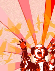
5. Paste your second vector image into the document.  Make it the middle layer.  Posterize it, and change the colors to match the color scheme.  Adjust the opacity level so that you can see through it to the back layer.

6. Now you need to create the text for your poster.  The poster should include the name of the artist/group, the venue (place) they are playing at, the date and time and if you choose, the opening band.  Pick a cool font and colors to match your color scheme.  Next, distort your text in some way.  First rasterize the type layers by right clicking on it and selecting Rasterize.  Now you can change the text in different ways.  You could click Edit–>Transform–>Skew, Distort, or Perspective.  Another option is to click Filter–>Distort and try out the different options.  Make sure your text is somewhat legible!  Use the skills you learned in the last TEXT assignment!

7. Phew!  Once you are finished, flatten image and save as a jpeg.  Post your poster to your blog.  What new did you learn how to do on photoshop with this assignment?  What do you think of your product?

Assignment 7: Text

1. Drop Shadow – Manual Drop Shadow

  1. Open a new document and type some text about 72 points.  Chose a thick font!
  2. Duplicate the type layer.
  3. Change the text color on the bottom layer to black.
  4. Move the black text layer several pixels down and to the right.
  5. Apply Filter > Blur > Gaussian with a radius of about 2-5 pixels depending on the type size.
  6. Adjust the opacity of the shadow layer as desired.
  7. Add some sort of background to your text.
  8. Flatten image and save as a jpeg under drop shadow.

2. 3D Text – Manual 3D Raised Text3D Emboss Text

  1. Open a new document ( 6 x 4″) and type some text about 72-100 points.  Chose a thick font!
  2. Duplicate the type layer twice. You should have three identical layers.
  3. Move the bottom-most layer two pixels up and two pixels left and change the type color to white.
  4. Move the middle layer two pixels down and two pixels right and change the type color to black.
  5. Fill the background with the same color as the topmost type layer.
  6. Flatten image and save as a jpeg under 3d.

3. Perspective Shadow Perspective Shadow

  1. Open a new document and type some text about 72 points.  Chose a thick font!
  2. Duplicate the type layer.
  3. Change the text color on the bottom layer to black.
  4. Skew the bottom layer to the right so it looks like a shadow on the ground.  Photoshop 5.5 &6.0 Edit–>Transform–>Skew Photoshop Elements Image–>Transform–>Skew
  5. Photoshop 5.5: Render the black type layer under Layer–> Type–> Render.   Photoshop 6.0 Rasterize the black type layer by right clicking on it and selecting Rasterize.  Photoshop 8.0 right click the black type layer by right clicking it and selecting simplify layer.
  6. Select the gradient tool and set the options for black to white.
  7. Hold the Ctrl key and click on the black type layer
  8. Click once at the baseline of the type, then hold the shift key down and click again at the tallest point of the shadow layer.
  9. Bump the shadow layer up one pixel.
  10. Add some sort of background to your text.
  11. Flatten image and save as a jpeg under Perspective Shadow.

4. Motion Text Motion Text

  1. Open a new document and type some text about 72 points. Italics work well.
  2. Duplicate the type layer.
  3. Render/Rasterize the bottom layer.
  4. Filter –> Stylize –> Wind: Method-Wind, From the Left
  5. Move the Wind layer a few pixels left.
  6. Filter –> Blur –> Motion Blur: Angle-0, Distance 10-15 pixels.
  7. Adjust the position of the blurred layer again if necessary.
  8. Reduce the opacity of the blurred layer to about 60-80%.
  9. Add some sort of background to your text.
  10. Flatten image and save as a jpeg under Motion.

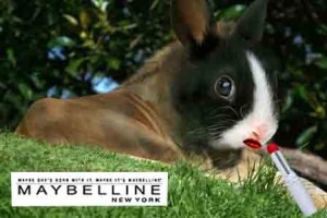
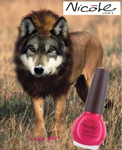
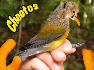
Project 2: Hybrid Animal AD

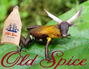
There are many hybrid animals in mythology, that is creatures that are a combination of  two or more animals.  One common hybrid is a mermaid (part woman, part fish).  What hybrids can you think of?  Here is a list from Wikipidia.

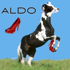
I want you to create your own hybrid using Photoshop, and have that hybrid advertize some product.  In my example, I made a Dog/Horse which is advertising Aldo shoes.  You may choose which animals to combine, and which product to endorse.  You will isolate different parts with the magnetic lasso tools.  Make your two creatures join as seamlessly as possible by adjusting the different parts to the right size, angle, color.

Include the Product (ie I put the shoe on the Lola Horse), and the Product Logo (ie the ALDO).  Think about composition and placement of the animal, background, product, and brand logo so it is well balanced and pleasing.

Use the clone tool for making fur/scales to cover where two parts are joining!  Make one animal part fade into the another by adjusting the opacity of the clone brush.   Good luck and have fun!  I will definitely demonstrate this for you because its a little complicated!